Fresh graduates usually have difficulty finding entry-level jobs. Most platforms cater to professionals, leaving graduates with fewer options.
MyJob App introduces an Entry Level mode, making it easier for graduates to find beginner-friendly roles tailored to their experience.
To understand the users, I interviewed some graduates and based on their indications created the Persona. Meet Sara.

"It is overwhelming when most of the job postings are for more professional individuals."
Sara graduated from college recently. She is currently babysitting as a temporary job to pay her loan. She has been looking for job search platforms however she finds it overwhelming when most of the job postings are for professional individuals.Also as a busy person she needs to check on the postings on the go.
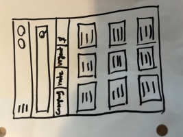
During the ideation process, I did crazy eight excercise to come up with ideas for wireframes.I tried my best to be as creative as possible and welcome all designs that came to my mind. Here are some of them:
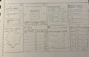

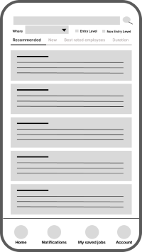
After Ideation process, I drafted some paper wireframes and made sure I have focused enough on search process. Since the entry level mode had to be one of the features, I used an entry level switch in most of my drafts.
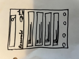
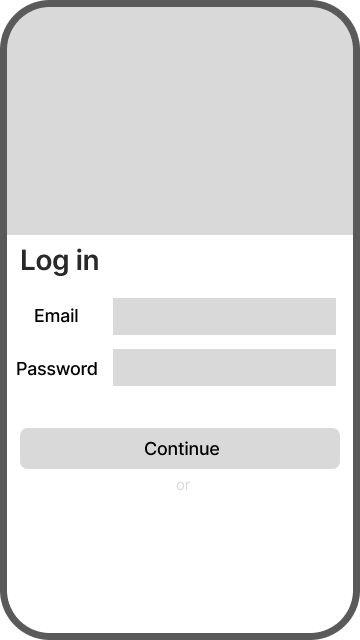
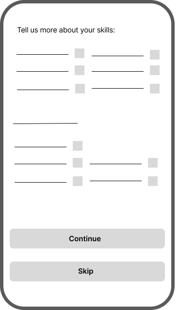
Based on paper wireframes, I came up with the digital ones which I desgined in Figma. I made sure to have entry level mode option available. Since it was one of the main pain points. I also added navigtion bar to make the browsing even smoother.
with low-fi wireframes, I created prototypes, which I could use in the usability study. The findings from the test leaded to indsights to modify my designs to better suit my users needs.
1
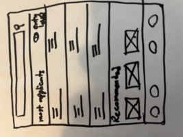
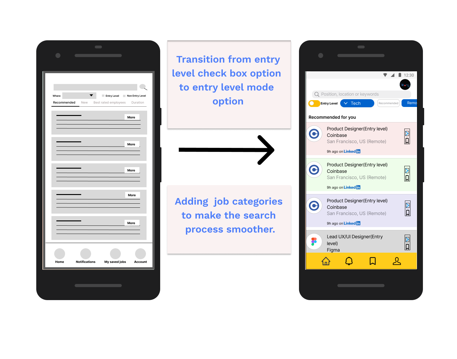
Finding: Most users were confused using entry level options. They thought it was confusing for them to choose from options.
Insight: The checkbox option can be transformed to more like a switch button so users can toggle back and forth
for the entry level option.
2
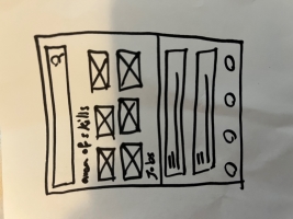
Finding: Most users would like to see job categories to be able to choose from them.
Insight: Job categories can be added, so that users are able to choose based on their desired categories.
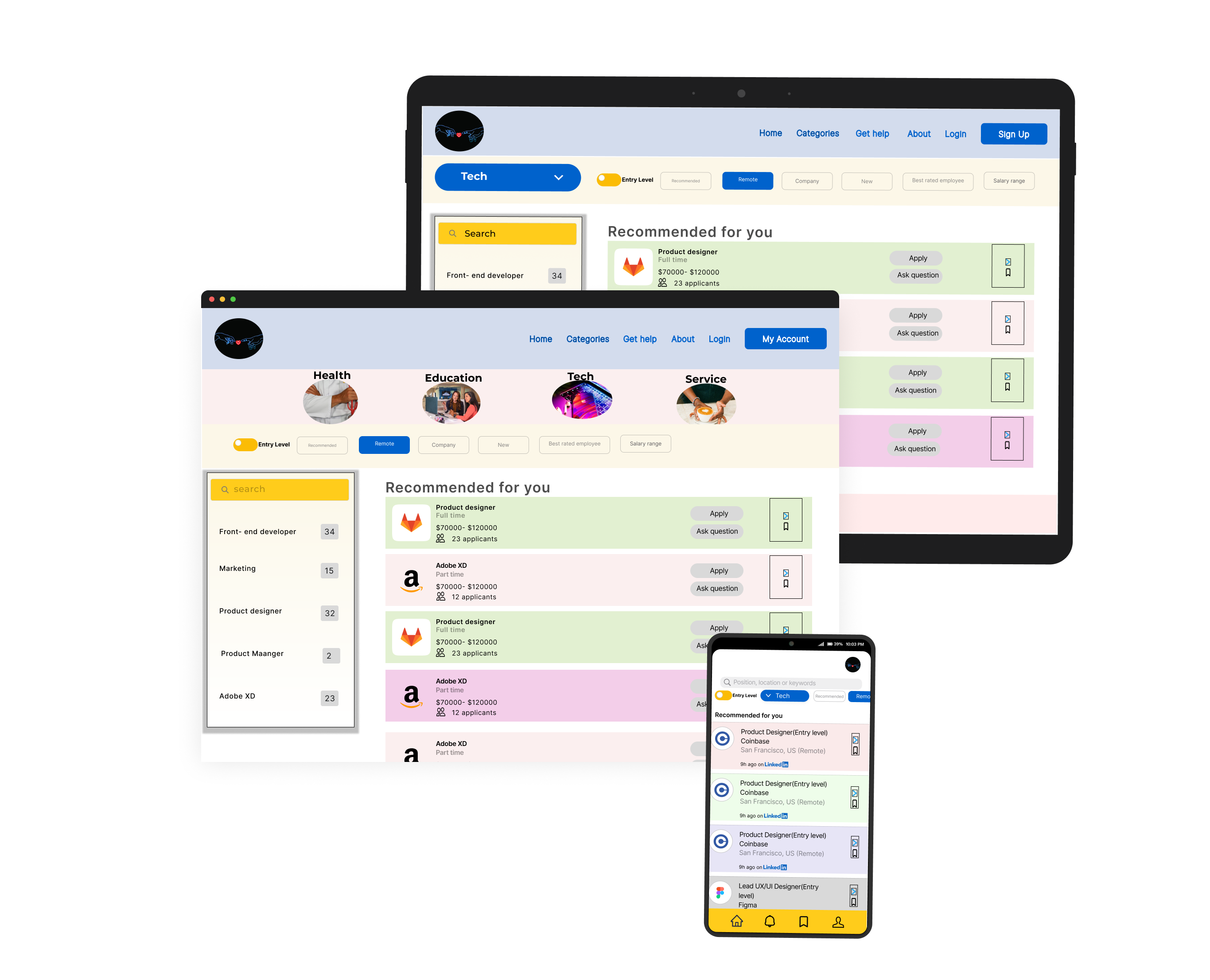
To design an accessible product that everyone could benefit from, I also designed a responsive website for different screen sizes like mobile, tablet and desktop. This way users still can reach to the product even if they have not installed the app.
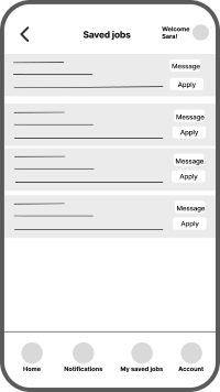
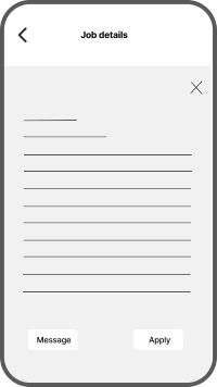
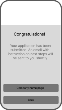
After designing low fidelity prototype and conducting usability tests, finally these are some of the mockups for the app.
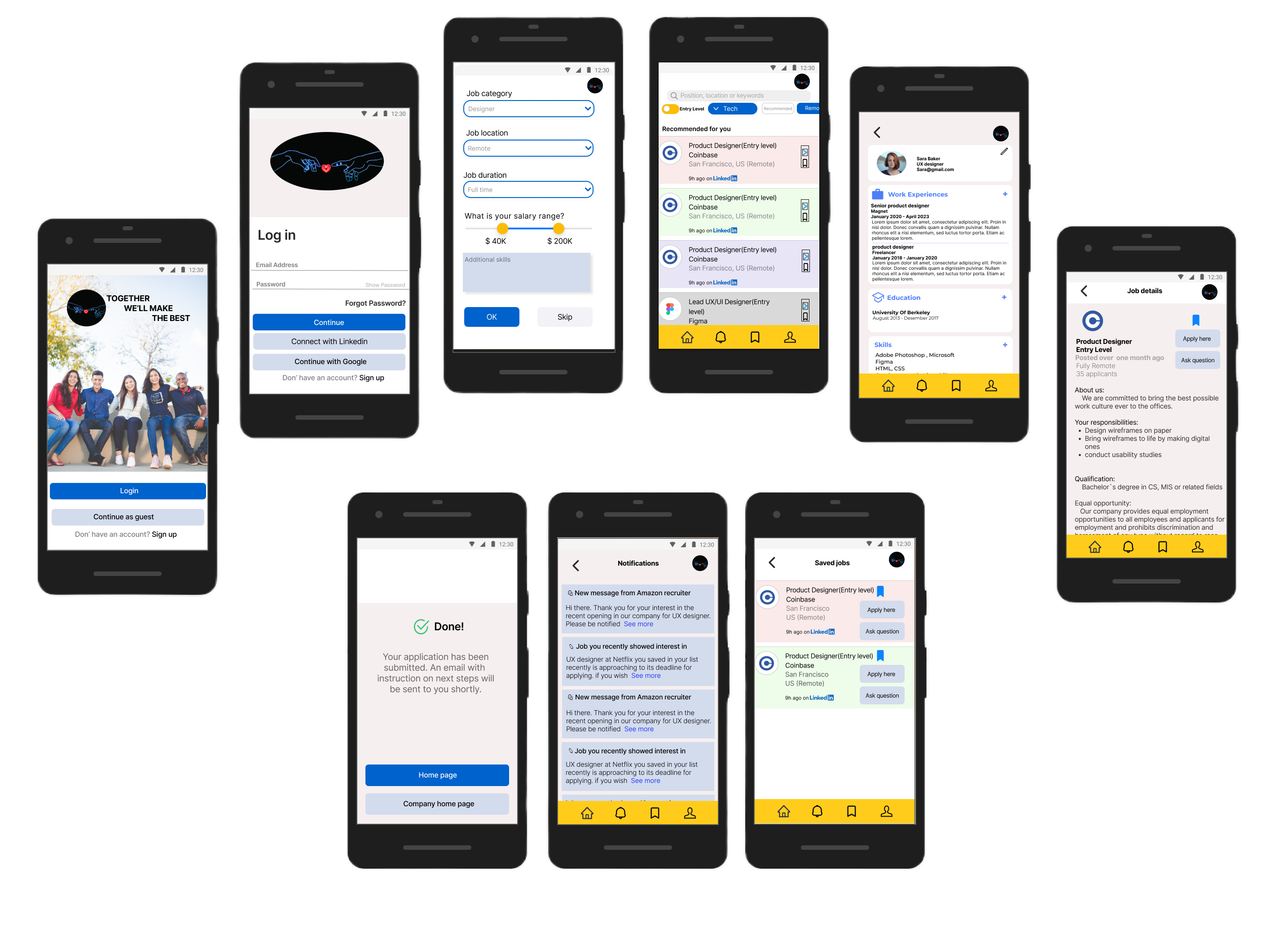
Here is a snapshot of the hi-fi prototype. This is based on last insights developed from usability tests. In next steps, other usability tests
will be conducted to measure the efficency of the current prototype and identify any new potential pain point.
The valuable fact that I learned during this design process was that even one small change in design of the
product can make a big impact on the user experience.