Flower2u is a trendy flower shop which has lots of customers. However, shoppers do not know what is available at store until they go there. This lack of information leave them unsatisfied with their shopping experiences. There wers other group of shoppers who were business owners that needed flowers regularly and did not have time to go in person.
Flowr2U app dedicated to bring fresh flowers to the customers who are families and also business owners that need fresh flowers regularly and they need flowers to get delivered to them. Flower2U app is designed to help them.
I conducted interviews and created user journeys to understand the users I am designing for, and their needs and pinpoints. A primary user group identified was the business owners who needed flowers regularly and did not have time to go in person to the store.

"I am a good chef who recently started to design meals and tables with flowers . Food is delicious with flowers close by."
Elliot is a chef who wants to expand his career into fine dining. For this reason he has come up with the idea to have a fresh knowledge of flowers and designing them to apply it in decorating his food and the way he serves them. He is frustrated since flowers are expensive and he has to go to store to order them which does not work for him since he has to make the food at the same time.
I prepared user`s journey map based on my persona. In this user journey the painpoints of the user to get their desired flowers is very clear.
Throughout the process of creating paper wireframes, I made sure tht feedbacks from users and their painpoints have been addressed. This mostly includes the delivery option. A smooth and easy checkout page was created to ensure the purpose of the app has been fulfilled.

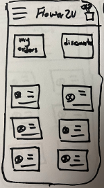
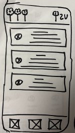
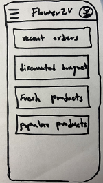
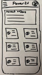
Based on paper wireframes, I came up with the digital ones which I desgined in Figma. I made sure to have entry level mode option available. Since it was one of the main pain points. I also added navigtion bar to make the browsing even smoother.
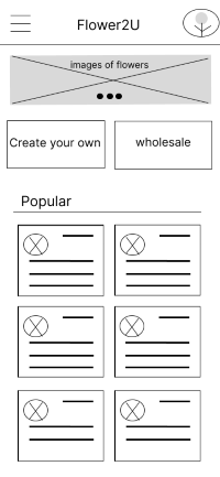
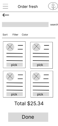
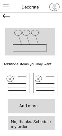
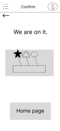
I conducted two rounds of usability test. Findings from the first one helped me design mockups from initial wireframes. The second study used a high-fidelity prototype nd showed areas that had to be refined.
1
1 Users wanted a less busy homescreen with fewer keys.
2 Users needed a prompt access to profile page .
2
1 The schedule option needs to be more intuitive with prompt icons.
2 Users needed a confirmation page right before placing their order.
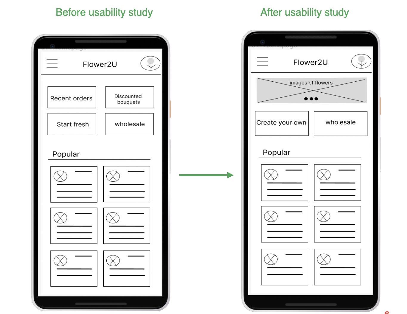
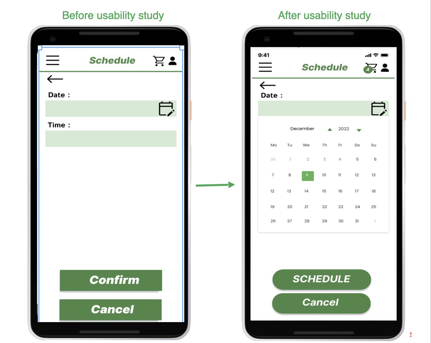
Icons made the navigation easier so that this process would be more intutive. Additionally. Images next to descriptions of flowers were used to help users better choose their flowers.
After designing low fidelity prototype and conducting usability tests, finally these are some of the mockups for the app.
.png)
Here is a snapshot of the hi-fi prototype. All insights from the tests, guided us to shape the app as it is in current version. In next steps, with more in depth tests, we try to get more insights and possibly change the app in each itteration.
Copyright © 2024 . All rights reserved to Zahra Ghasemi