Busy individuals with various interests need to spend hours to find their favorite DIY projects to work on. Lack of good, integrated sources discourages individulas to find their projects.
DIYer website help users find and view their favorite projects easily and effectively.
To understand the users and their main painpoints, I conducted researches and interviews and based on my findings created persona.

"I get relly disappointed when I spend hours to find the best suited DIY project and get nothing out of it. "
Laura is an artist who has a busy schedule as a mom and designer. She wants to develope her own media platform to deliver DIY projects to everyone. Before that she needs to make sure she has sufficient information and projects ready. So every weekend she looks into DIY projects to find her favorite ones. She gets frustrated since there is not a good source with categorized DIY projetcs.
I prepared user`s journey map based on my persona. In this user journey the painpoints of the user to get their desired DIY project is very clear.
With all investigation about users, their main painpoints and needed parts for the website , I came up with the digital wireframes which I desgined in Adobe XD.
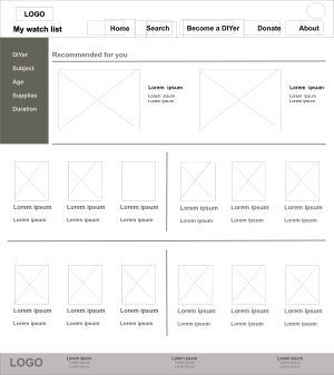
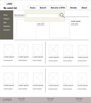
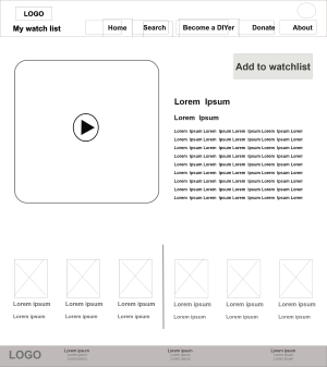
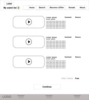
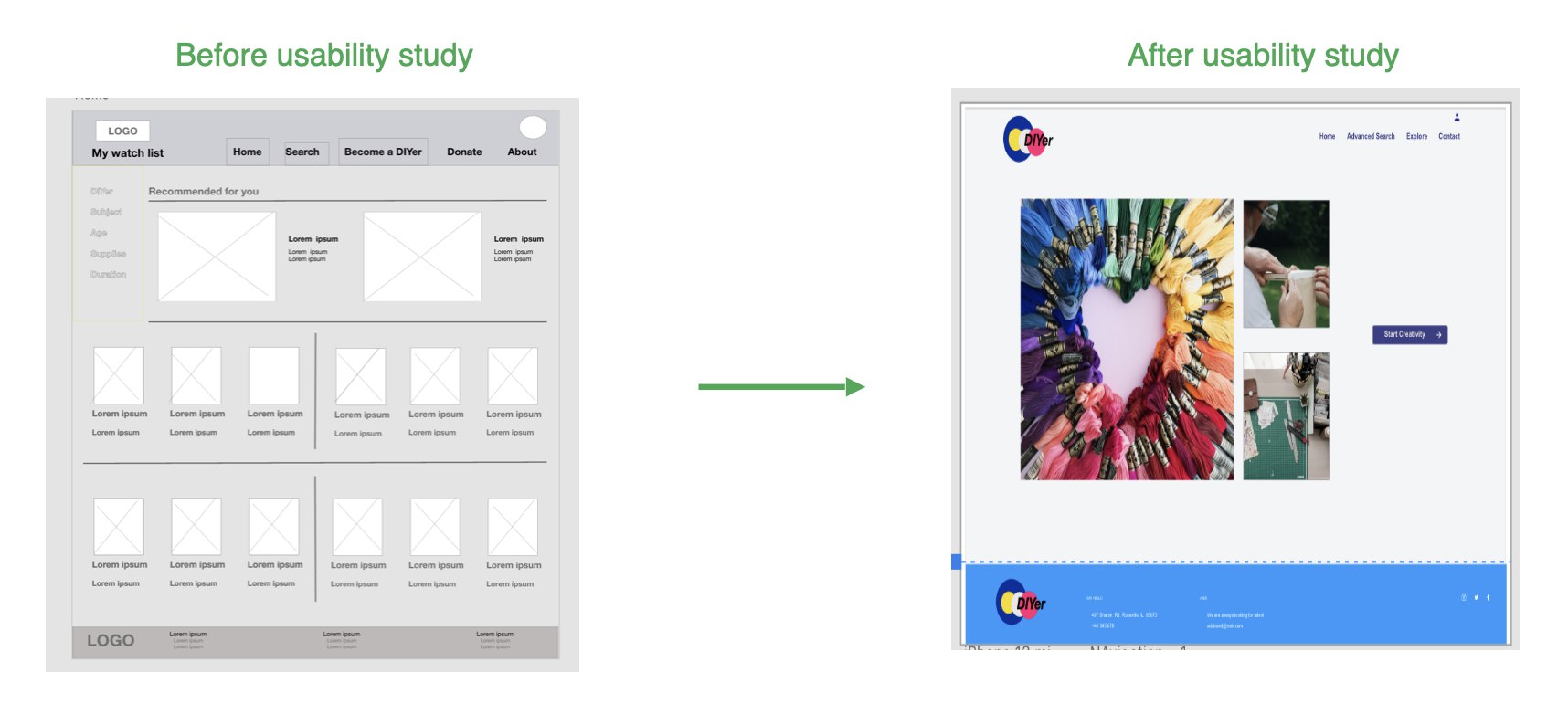
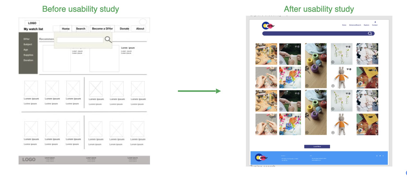
I conducted usability tests to get insights about needed modifications. Findings from usability teats are valuable since they are a potential insight to cause good modification.
1
1 Users wanted a button next to each DIY grid to put it in their favorite list.
2 Users expressed that there has to be some ways to switch between options in each search area .
2
1 The homepage was too busy for some of the users, so I created a cleaner version of it.
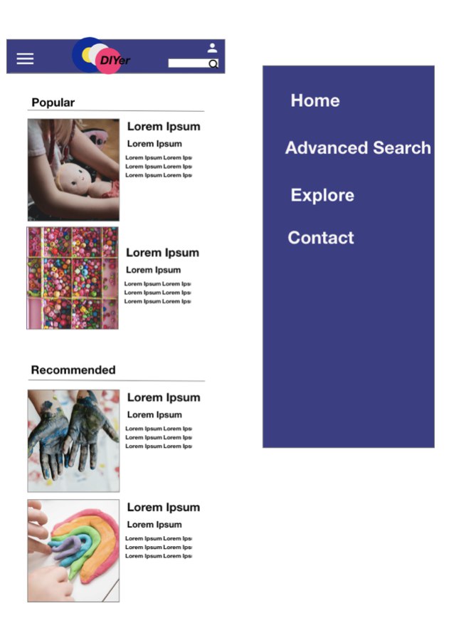
To design inclusively, I added designs for different screen size variations. I incuded a design for phone screen size.
After designing low fidelity prototype and conducting usability tests, finally these are some of the mockups for the website.
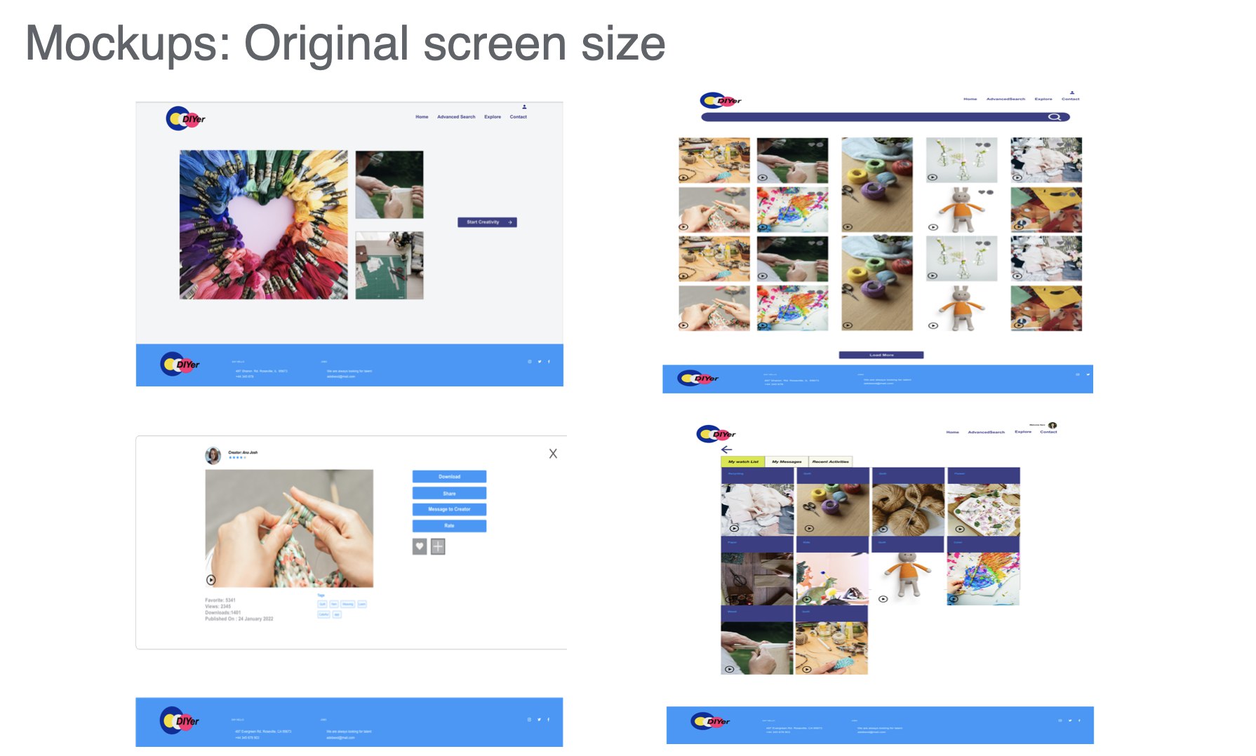
Here is a snapshot of the hi-fi prototype. This is based on last insights developed from usability tests. I will have more tests in next steps as each itteration will result in some new insights.
Copyright © 2024 . All rights reserved to Zahra Ghasemi